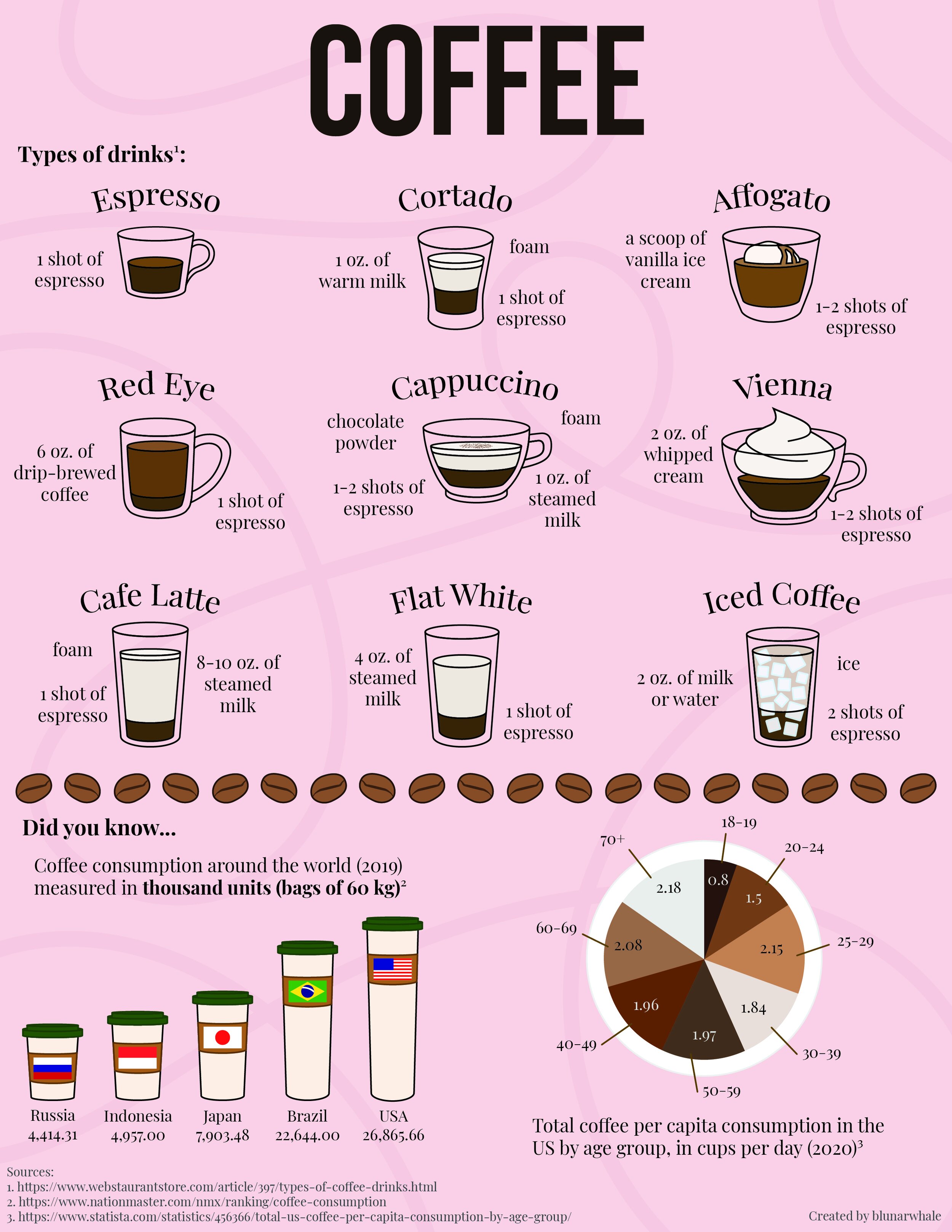
Coffee!
Infographic Since having my first taste of espresso in Italy several years ago, I knew I couldn’t go back to what I usually have here (iced, diluted, and sugar-loaded coffee). I started trying out different types of drinks and learning more about the beans (this is another story). One thing I noticed is how some places do not have descriptions of what those drinks are. I blindly tried cortado and fell in love with it. I went on a trip to Australia and saw so many names I have no idea what they meant. This chart is my reference chart and it only includes a handful. This was also a good practice for me to create objects using the shape tool in Illustrator.
The bottom part is the numbers part. I picked two, world coffee consumption and consumption in the US by age group. U.S.A. ranked number one in coffee consumption, which surprised me. I had the idea of coffee cup sizes. Then the pie chart is a bird-eye view of a coffee cup.
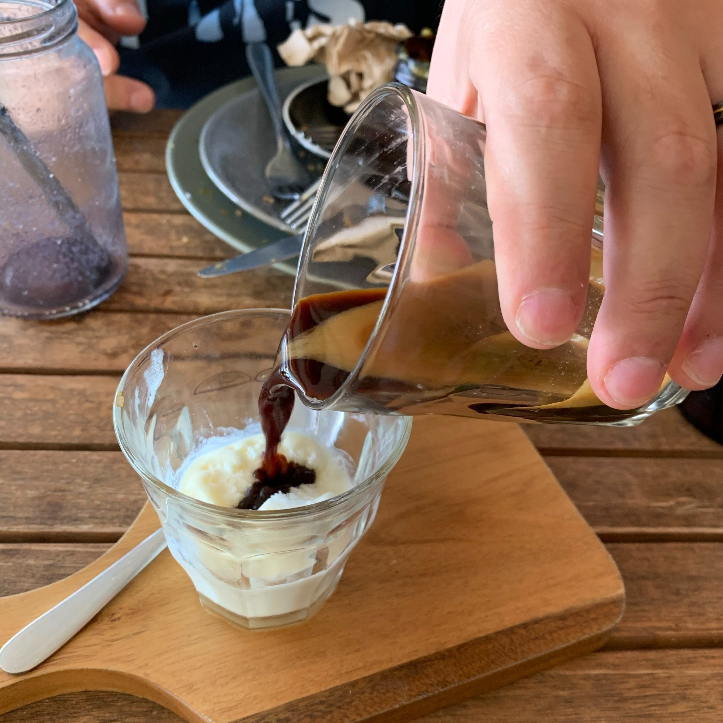
As you can see, I do consume plenty of coffee. Cortado and affogato are my usual go-to.