
Soo Crafts
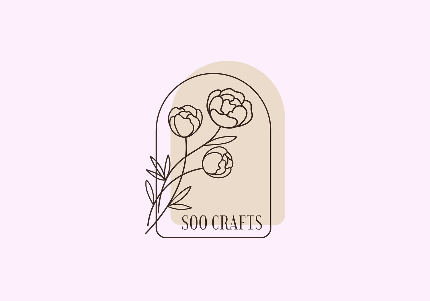
Logo DesignSoo Crafts is a one-woman business that sells polymer clay accessories. This logo started with a purpose of using it as a stamp in mind. The vibes from this brand are simple, sweet, and soft. The thin, serif font brings minimalism and classy feel to the branding. A small flower bouquet framed by an arched window are all outlines, similar style to the stamp designs used for her products. The color choices were closer to the natural color of brown and tan. Instead of black, I used dark brown to keep it warm. I made a few variations where the logo could still be clear and visible on smaller scales.
We also did a small collaboration, my first earrings from her. She did the top part with polymer clay (look at those creamy gradients) and I added the beaded components.
