Q to Q Consulting
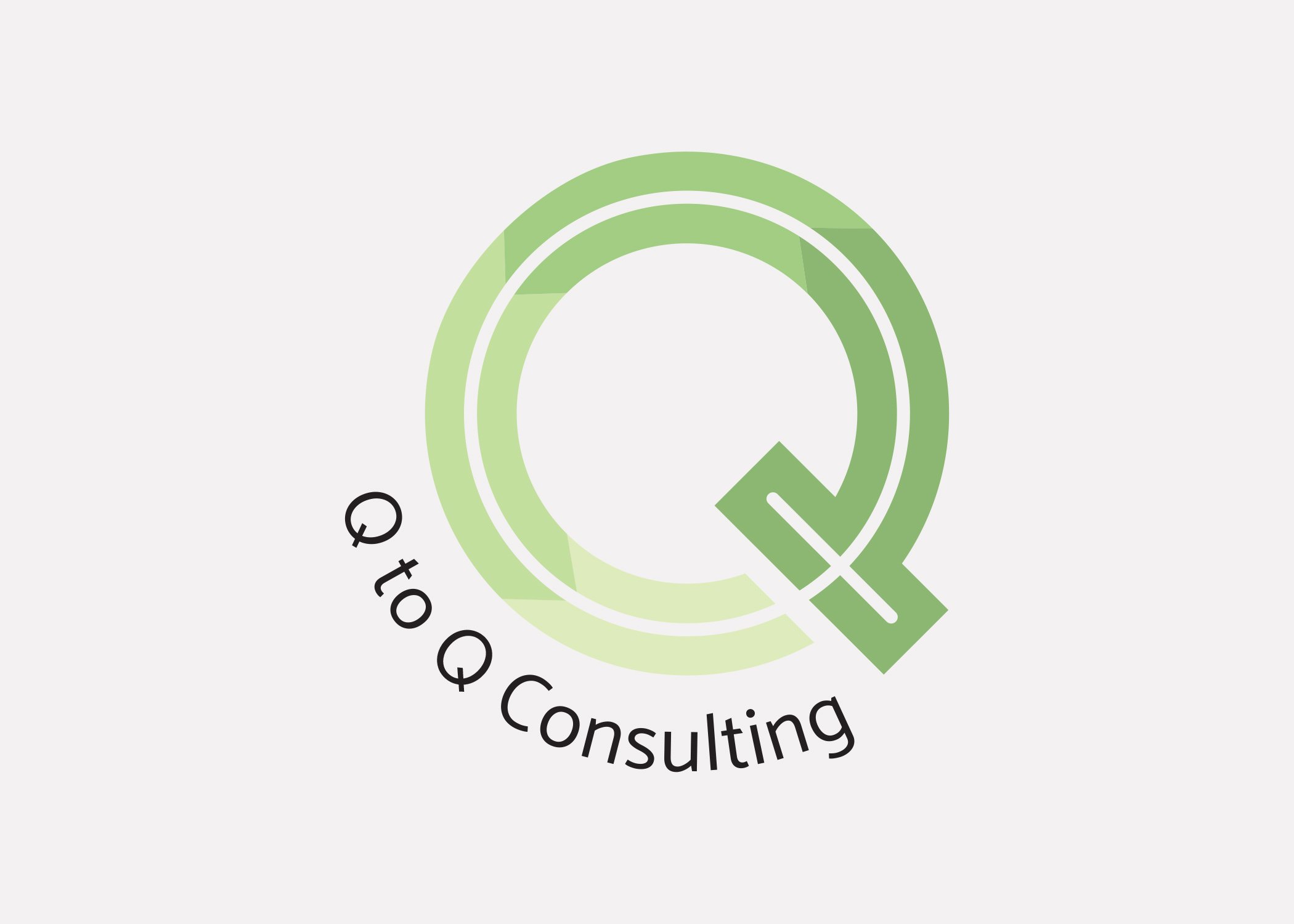
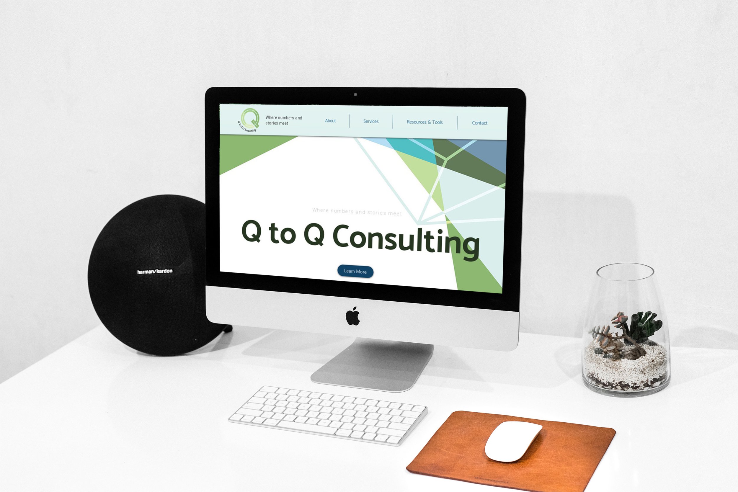
Branding | Logo DesignQ to Q Consulting has just founded and was in need of three things: a logo, a website design, and a business card. Starting with the logo, we focused on the “Q’s” which represented “qualitative” and “quantitative” and the idea of ever-changing data.
The transparent “Q” in bigger “Q” is a play on the intersection of two different types of data. The arrows represented two things: the flow and the arrow line often seen in the x-y axis chart. The client wants to use green as her main color and geometric shapes as part of its theme. This contributed to the overall look for both website and business cards.


